2.4 Representing the Relationship Between Two Quantitative Variables
6 min read•december 29, 2022
Peter Cao
Jed Quiaoit
Peter Cao
Jed Quiaoit
AP Statistics 📊
265 resourcesSee Units
In a bivariate quantitative data set, we often have two sets of quantitative data that are related or dependent in some way. One of the variables, referred to as the "independent" or "explanatory" (x) variable, is thought to have an effect on the other variable, which is referred to as the "dependent" or "response" (y) variable. The explanatory variable is often used to explain or predict the value of the response variable.
For example, in a study examining the relationship between age and blood pressure, age might be the explanatory variable and blood pressure the response variable. In this case, the value of the explanatory variable (age) might be used to predict the value of the response variable (blood pressure).
What is a Scatterplot?
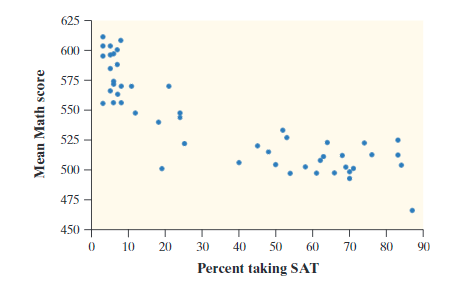
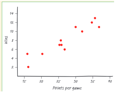
We can organize this data into scatterplots, which is a graph of the data. On the horizontal axis (also called the x-axis) is the explanatory variable and on the vertical axis is the response variable. The explanatory variable is also known as the independent variable, while the response variable is the dependent variable. Here are two examples below:

Graph 1

Graph 2
Both images courtesy of: Starnes, Daren S. and Tabor, Josh. The Practice of Statistics—For the AP Exam, 5th Edition. Cengage Publishing.
Describing Scatterplots
When given a scatterplot, we are often asked to describe them. In AP Statistics, there are four things graders are looking for when asked to describe a scatterplot, or describe the correlation in a scatterplot.
Form
The form of a scatterplot refers to the general shape of the plotted points on the graph. A scatterplot may have a linear form, in which the points form a straight line, or a curved form, in which the points follow a curved pattern. The form of a scatterplot can be useful for understanding the relationship between the two variables and for identifying patterns or trends in the data. ✊
For example, a scatterplot with a linear form might indicate a strong, positive relationship between the two variables, where an increase in one variable is associated with an increase in the other. A scatterplot with a curved form might indicate a nonlinear relationship between the two variables, such as a quadratic relationship, where the relationship between the variables is not a straight line.
In the scatterplot above, Graph 1 is best described as curved, while Graph 2 is obviously linear.
Direction
The direction of the scatterplot is the general trend that you see when going left to right. Graph 1 is decreasing as the values of the response variable tend to go down from left to right while graph 2 is increasing as the values of the response variable tend to go up from left to right. ➡️
In a linear model, the direction of the relationship between two variables is often described in terms of positive or negative correlation. Positive correlation means that as one variable increases, the other variable also tends to increase. Negative correlation means that as one variable increases, the other variable tends to decrease.
The slope of the line that fits the data can be used to determine the direction of the correlation. If the slope is positive, the correlation is positive, and if the slope is negative, the correlation is negative.
For example, consider a linear model that shows the relationship between age and height. If the slope of the line is positive, it indicates that as age increases, height tends to increase as well. This would indicate a positive correlation between age and height. On the other hand, if the slope of the line is negative, it would indicate a negative correlation between age and height, where an increase in age is associated with a decrease in height.
Strength
The strength of a scatterplot describes how closely the points fit a certain model, and it can either be strong, moderate, or weak. How we figure this out numerically will be on the next section about correlation and the correlation coefficient. In our case, Graph 1 shows a medium strength correlation while Graph 2 shows a strong strength correlation. 🥋
Unusual Features
Lastly, we have to discuss unusual features on a scatterplot. The two types you should know are clusters and outliers, which are similar to their single-variable counterparts. 👽
Clusters are groups of points that are close together on the scatterplot. They may indicate that there are subgroups or patterns within the data that are different from the overall trend.
Outliers are points that are far from the other points on the scatterplot and may indicate unusual or unexpected values in the data. Outliers can be caused by errors in data collection or measurement, or they may indicate a genuine difference in the population being studied.
It's important to consider unusual features on a scatterplot when analyzing the data, as they can influence the interpretation of the relationship between the two variables and the results of statistical analyses.
Example
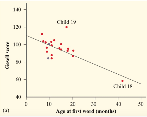
Describe the scatterplot in context of the problem.

Courtesy of Starnes, Daren S. and Tabor, Josh. The Practice of Statistics—For the AP Exam, 5th Edition. Cengage Publishing.
A sample answer may look like this: "In the scatterplot above, we see that it appears to follow a linear pattern. It also shows a negative correlation since the Gesell score seems to decrease as the age at first word increases. The correlation appears to be moderate, since there are some points that follow the pattern exactly, while others seem to break apart from the pattern. The data appears to have one cluster with an outlier at Child 19, because the predicted Gesell Score for Child 19 (value at line) has a large discrepancy from the actual Gesell score (value at point). Also, the data has an influential point that is a high leverage point with Child 18 because it heavily influences the negative correlation of the data set."
**Notice that this response is IN CONTEXT of the problem. This is a great way to maximize your credit on the AP Statistics exam.
Side Note: Outliers, Influential Points, and (High) Leverage Points

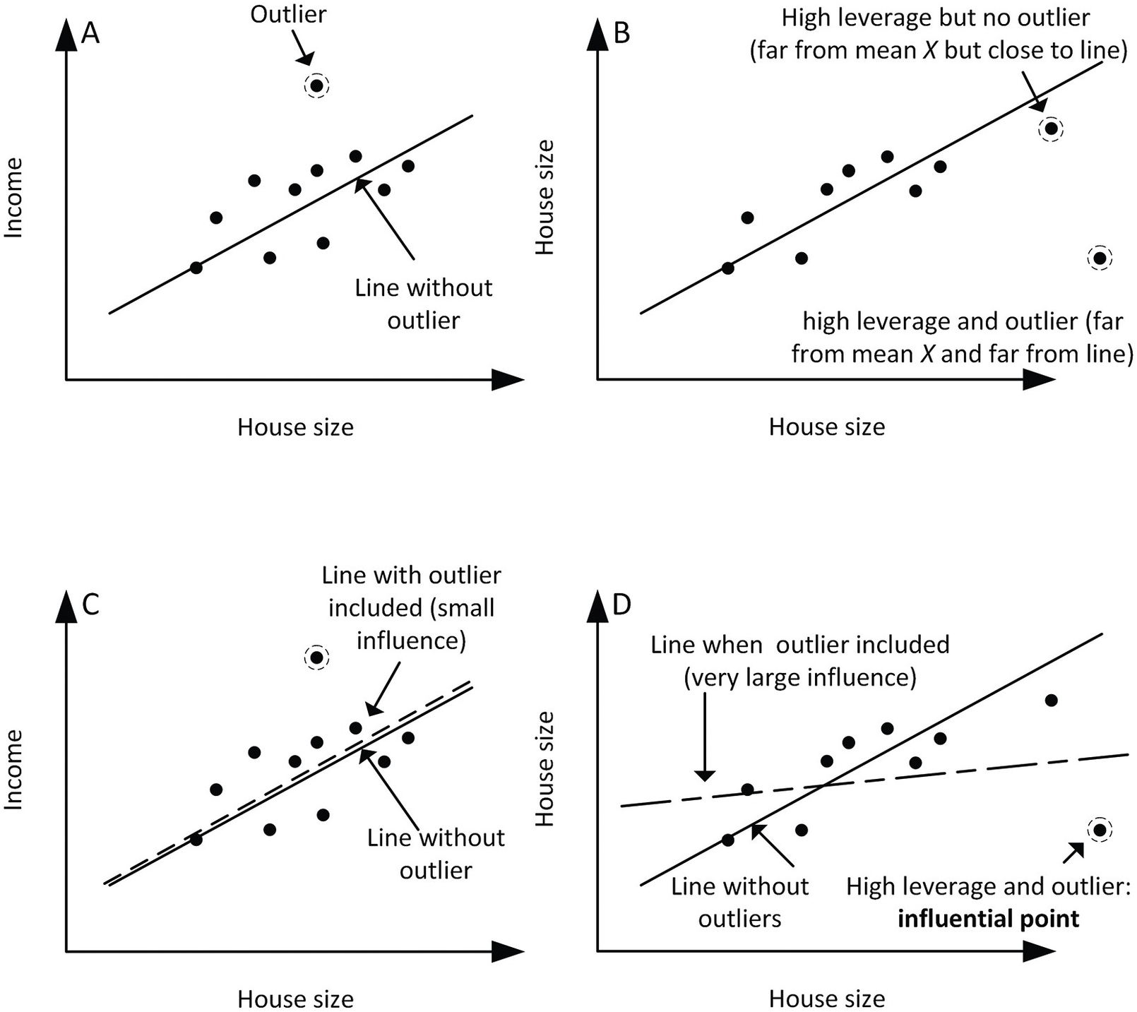
Source: Cambridge University Press
After going through the example problem above, the biggest question you might have in mind is: Whats the difference between outliers, influential points, and high leverage points--given that they all greatly impact scatterplot trends, correlations (to be discussed in-depth in the next section), and such? 🪞
- An outlier is a data point that is significantly different from the rest of the data in a dataset. Outliers can have a significant impact on the results of statistical analyses and can potentially distort the overall pattern of the data.
- An influential point is a data point that has a significant impact on the regression line or the fitted model, but it is technically not an outlier. Influential points can cause the regression line to change direction or curvature, and they can have a large influence on the slope and intercept of the line.
- A high leverage point is a data point that has a large value for one of the independent variables in a regression model. High leverage points can have a large influence on the fitted model, and they can be detected by examining the leverage values for each data point. High leverage points may or may not be outliers.
In summary, outliers are data points that are significantly different from the rest of the data, influential points are data points that have a significant impact on the fitted model, and high leverage points are data points that have a large value for one of the independent variables and can have a large influence on the fitted model.
🎥 Watch: AP Stats - Scatterplots and Association
Browse Study Guides By Unit
👆Unit 1 – Exploring One-Variable Data
✌️Unit 2 – Exploring Two-Variable Data
🔎Unit 3 – Collecting Data
🎲Unit 4 – Probability, Random Variables, & Probability Distributions
📊Unit 5 – Sampling Distributions
⚖️Unit 6 – Proportions
😼Unit 7 – Means
✳️Unit 8 – Chi-Squares
📈Unit 9 – Slopes
✏️Frequently Asked Questions
✍️Free Response Questions (FRQs)
📆Big Reviews: Finals & Exam Prep

© 2023 Fiveable Inc. All rights reserved.